A tabbed feature explorer instead of a wall of text
The most interesting piece on the site. Visitors click through capabilities one at a time instead of scrolling past a long list.
A marketing site for an AI recruitment product.
A marketing site for an AI recruitment product, built around content-driven sections and a tabbed feature explorer.
Frontend, solo
Client website · Frontend
React · Vite · React Router · Tailwind CSS 3
A tabbed feature explorer instead of a wall of text
Live client site
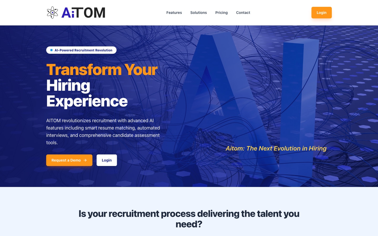
The product does a lot, and the temptation on a site like this is to explain all of it on the homepage. I tried to do the opposite: a clear promise up top, then features, solutions, pricing and contact on their own pages, so a visitor can go as deep as they want.
I built the frontend: design implementation, structure, build and deployment. To be clear, I didn’t build the recruitment product itself. That is someone else’s work.
The product, in five steps.
The most interesting piece on the site. Visitors click through capabilities one at a time instead of scrolling past a long list.
Features, pricing tiers and copy live in a content module. Changing a price is a one-line edit, though it still needs a build and a deploy. It is not a CMS.
This is a focused marketing build, not a platform. A handful of routes, a lead form, responsive navigation. It does its job.
Live at ai-tom.com. My part is the public site and its delivery.
Numbers on this page are as of September 2026.The site is live above. If you have a similar project in mind, I am happy to explain how I approached this one and what yours would need.
Start a conversationOpens your email client · ypraveen760@gmail.com